IPG Mediabrands
D100 — Brand Launch Film
As we approach the 12 year mark for smartphone and wearable technology, significant data has now been collected on the possible negative side effects of smartphone culture. There are studies that suggest that long term exposure to ’blue light ’screens could be harmful to the users eye sight. Another study suggests that sleep patterns can be disrupted in users that stare at screens for prolonged periods of time.
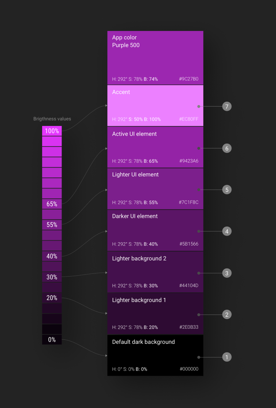
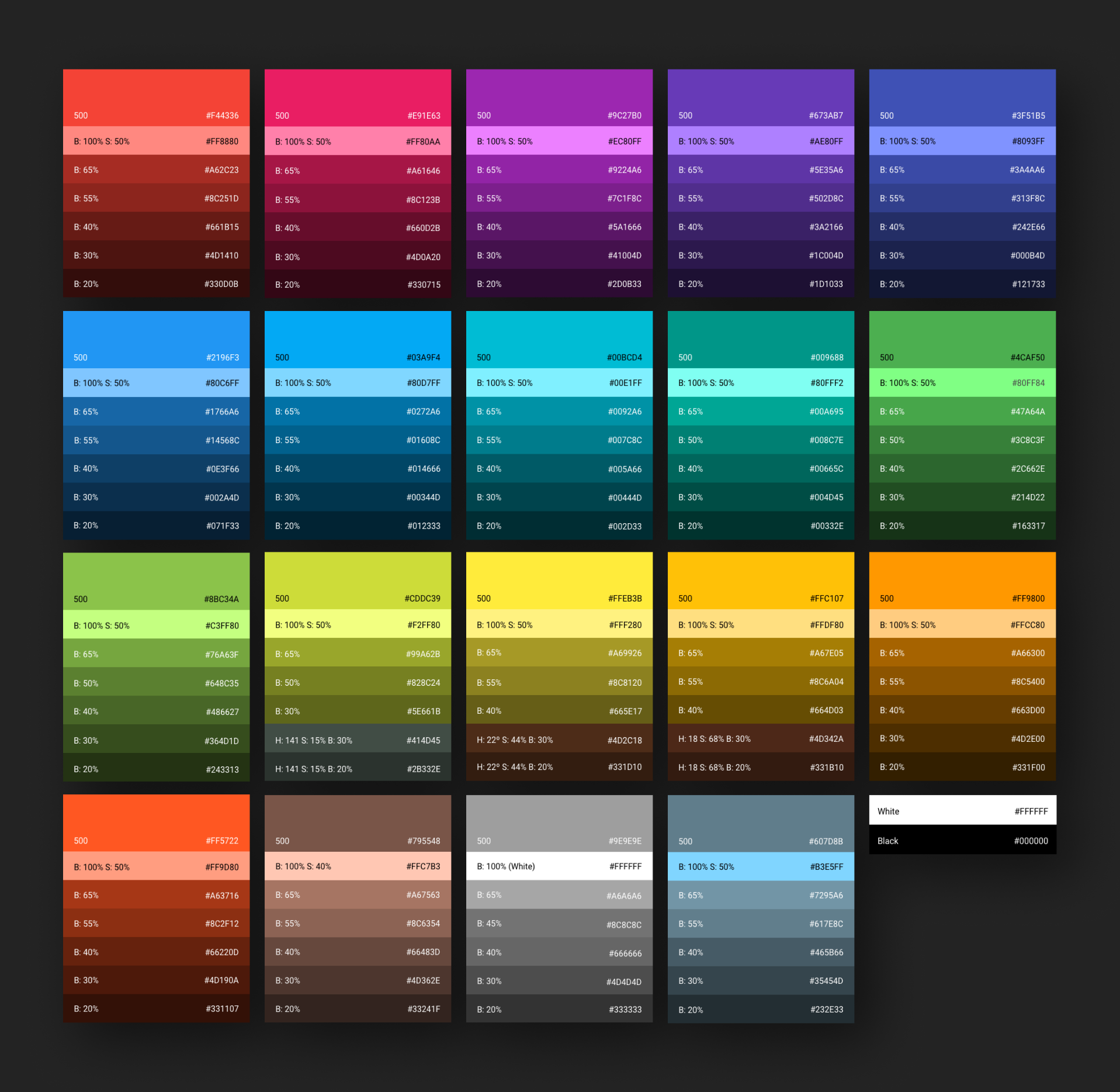
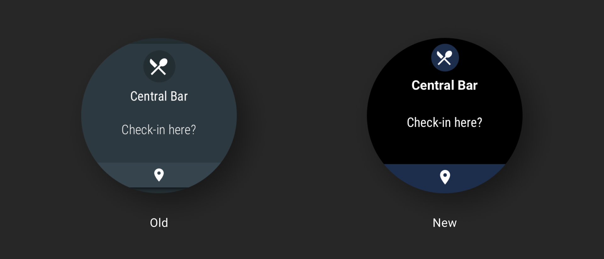
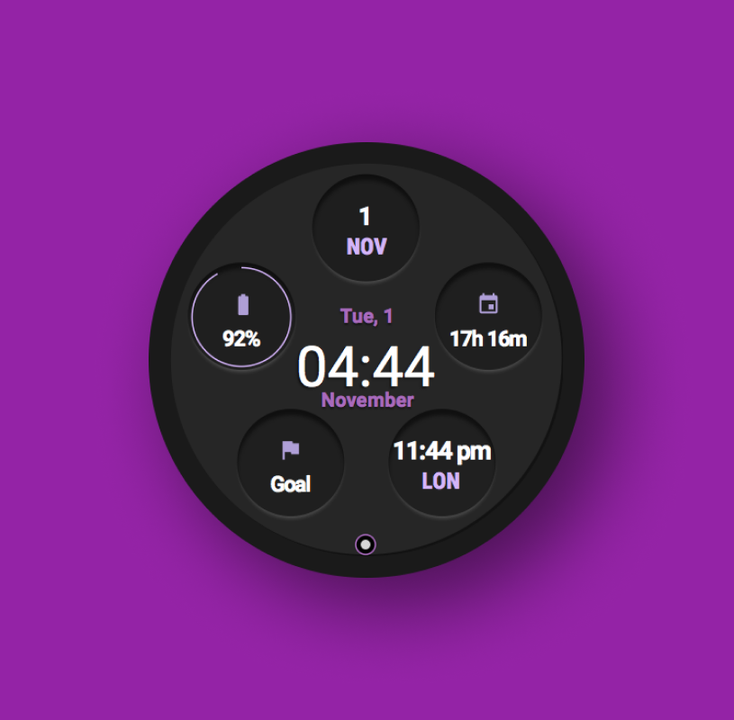
To curb these negative effects Google took the step to switch the palette of the Wear OS (formerly Android Wear) brand UI to completely darker tones which would help with glanceability and also improve battery life since the screens running dark UI leave pixels powered off in order to display deeper blacks.
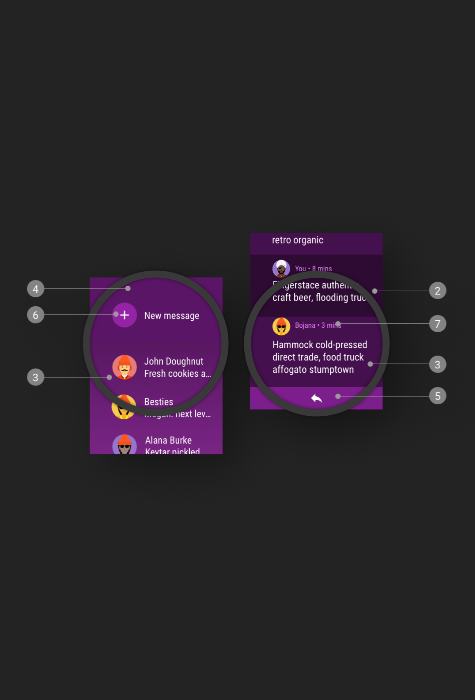
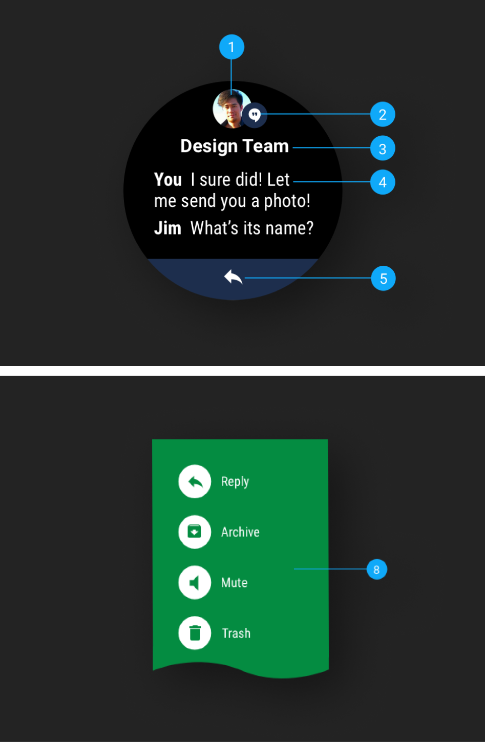
As part of an on going relationship with Google’s Wear OS design department, Midnight Sherpa was tasked with assisting in the implementation of a brand wide transition to ‘Dark UI’. Midnight Sherpa contributed and updated UI design assets working closely with the design team at Google Wear OS to create the new brand guide lines in order to launch the materials design site refresh. The materials design site is the sole reference resource for thousands of independent Wear OS app developers worldwide.
With so many apps and system screens to update there was a need to implement complex asset tracking systems for quality control and practical testing of all the design assets. Acting as an extension of the Wear OS design team Midnight Sherpa played a pivotal role in bringing the Dark UI system theme online within the schedule of the larger OS update.